Details
-
Type:
 Bug
Bug
-
Status:
 Closed
(View Workflow)
Closed
(View Workflow)
-
Priority:
 Normal
-
Resolution: Fixed
-
Affects Version/s: UA 4.0.0.3
-
Fix Version/s: UA 4.0.0.6
-
Component/s: User Administration
-
Labels:
-
Customer:Mobinets
Description
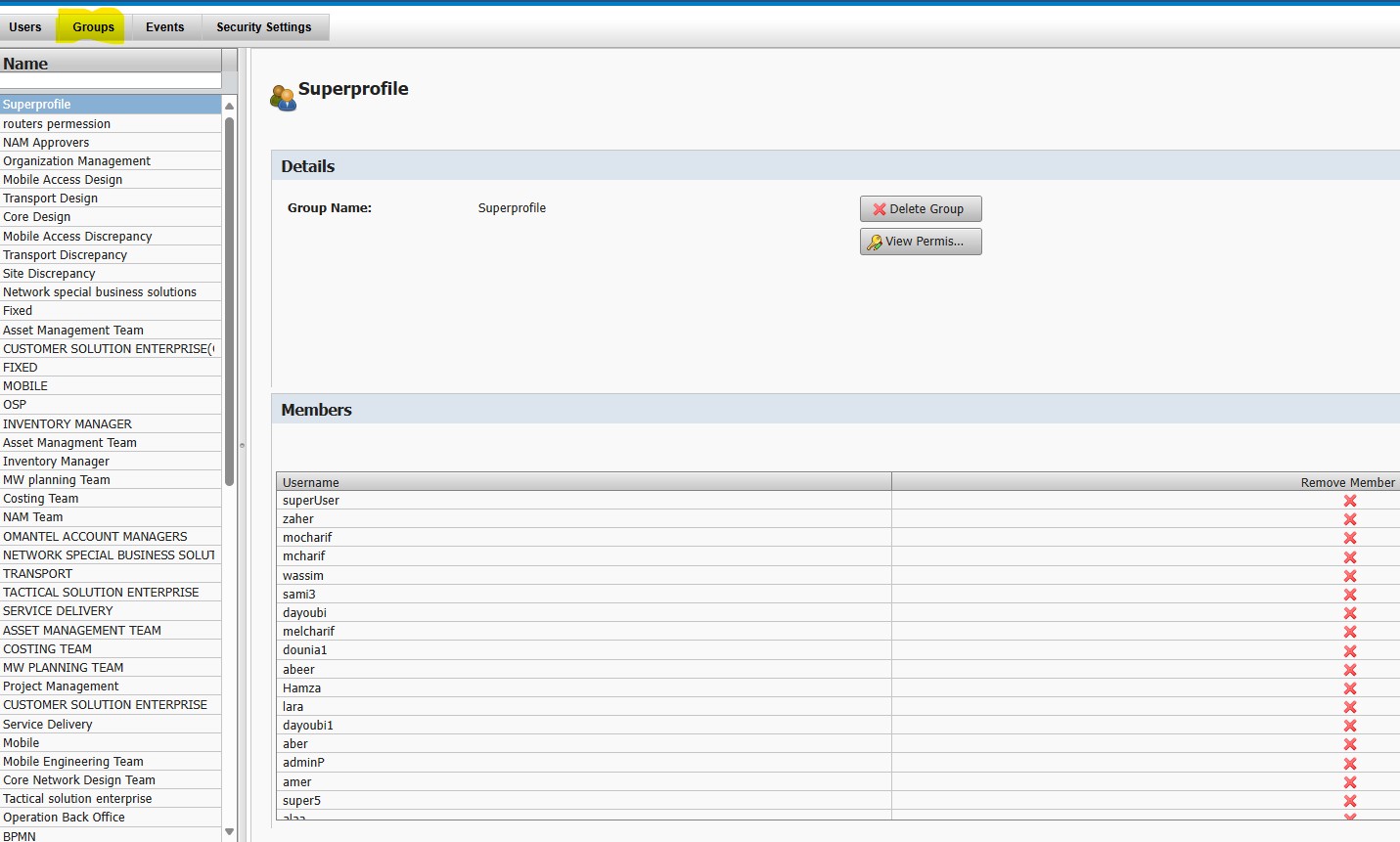
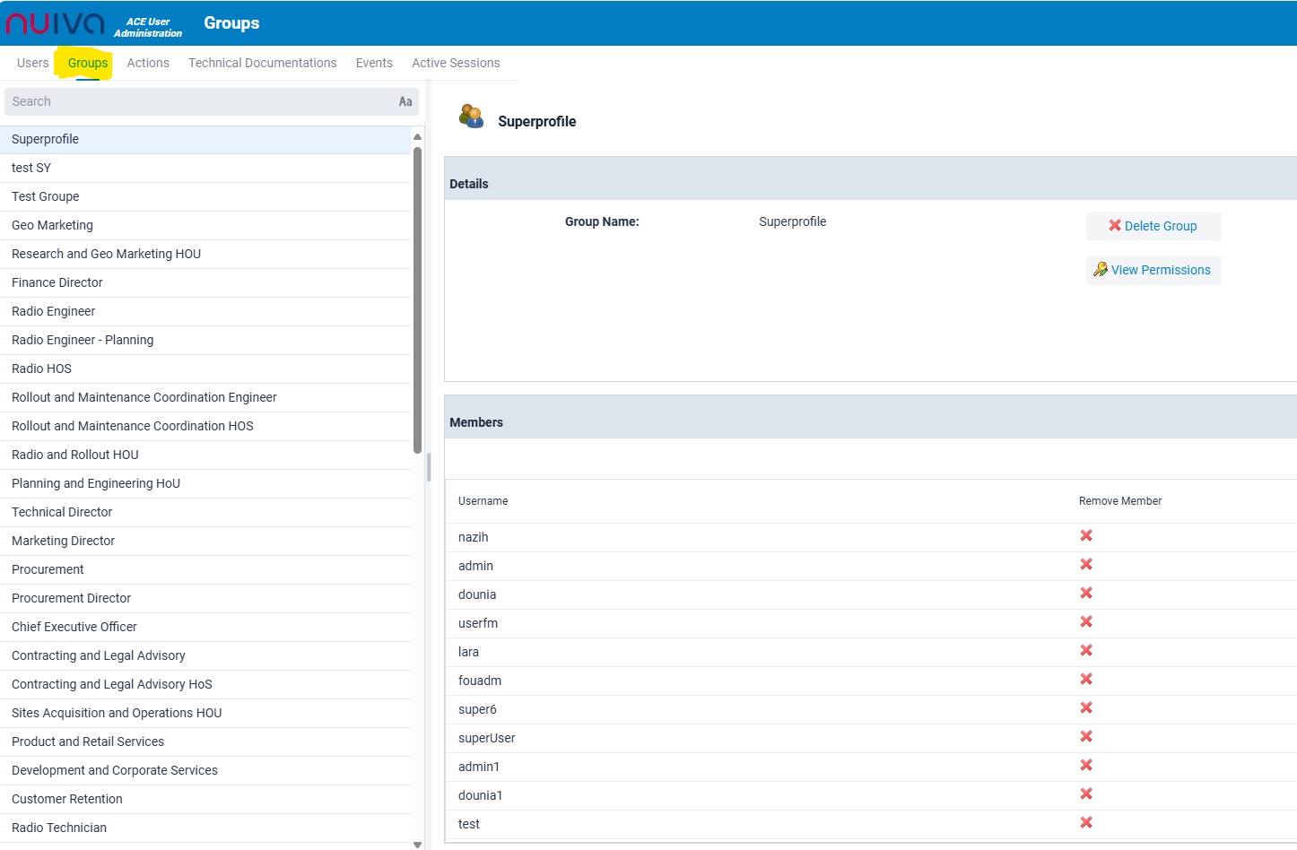
Improve the alignment of the user list and ensure that there is enough padding between the user names and the "Remove Member" buttons. The old version has a better spacing layout, which should be mimicked in the new version to make the list more readable and less cluttered.
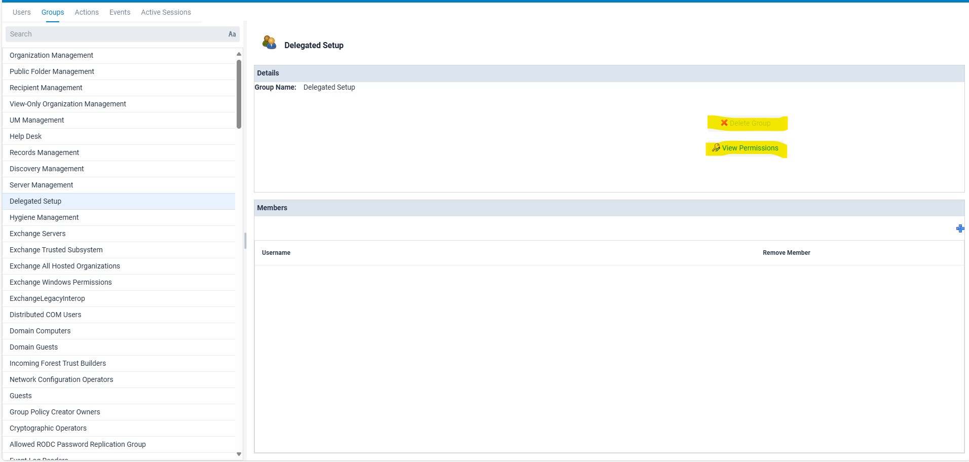
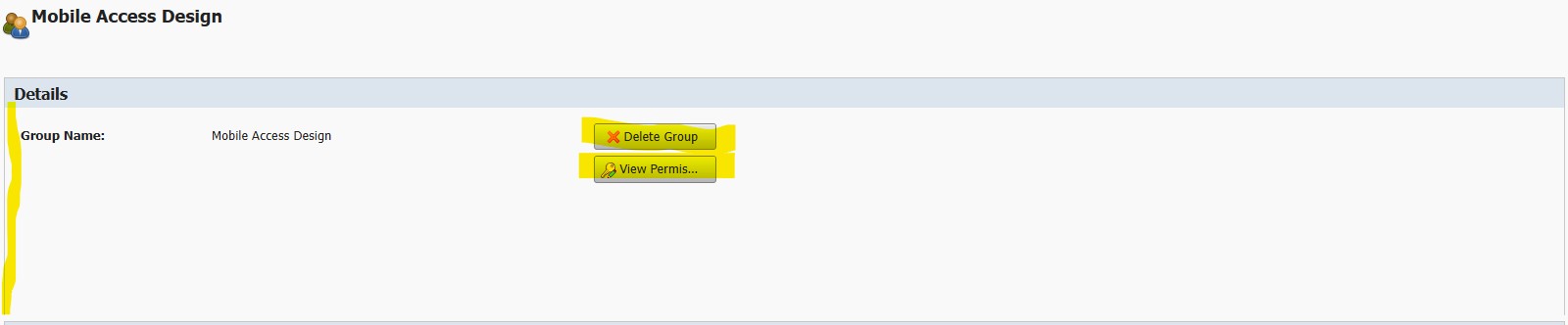
Review the alignment of the texte and the contraste of the bottons in the Top of the Groups List Windows, refer to the attached images for comparison
Attachments
Activity
- All
- Comments
- Work Log
- History
- Activity
- Links Hierarchy
- Transitions
- Trace
this contrast is generated by default using Vaadin in the disabled case
Show
 Abdel Rahman Tout
added a comment - this contrast is generated by default using Vaadin in the disabled case
Abdel Rahman Tout
added a comment - this contrast is generated by default using Vaadin in the disabled case
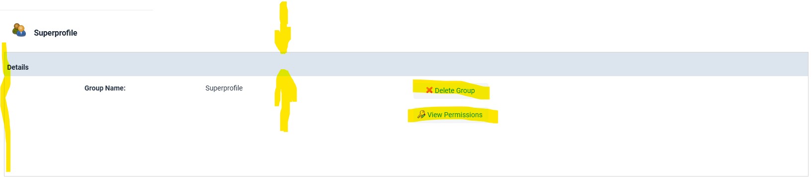
Seems to be ok, remains only the contrast of the DelerteGroup/ViewPermissions odtions
Reduce the panel of "Details" and "Members"
Align the Close Button in the Grid to the Center.
Align the "Group Name" and it value to the left.
Show
Abdel Rahman Tout
added a comment - Reduce the panel of "Details" and "Members"
Align the Close Button in the Grid to the Center.
Align the "Group Name" and it value to the left.
Fixed
However I find that the contrast of the text and for some bottons is not enough. It seems that the contrast of the non active buttons for example is generated by default in Vaadin.