Details
-
Type:
 Bug
Bug
-
Status:
 Closed
(View Workflow)
Closed
(View Workflow)
-
Priority:
 Normal
-
Resolution: Fixed
-
Affects Version/s: UA 4.0.0.3
-
Fix Version/s: UA 4.0.0.6
-
Component/s: UCMDB
-
Labels:
-
Customer:Mobinets
Description
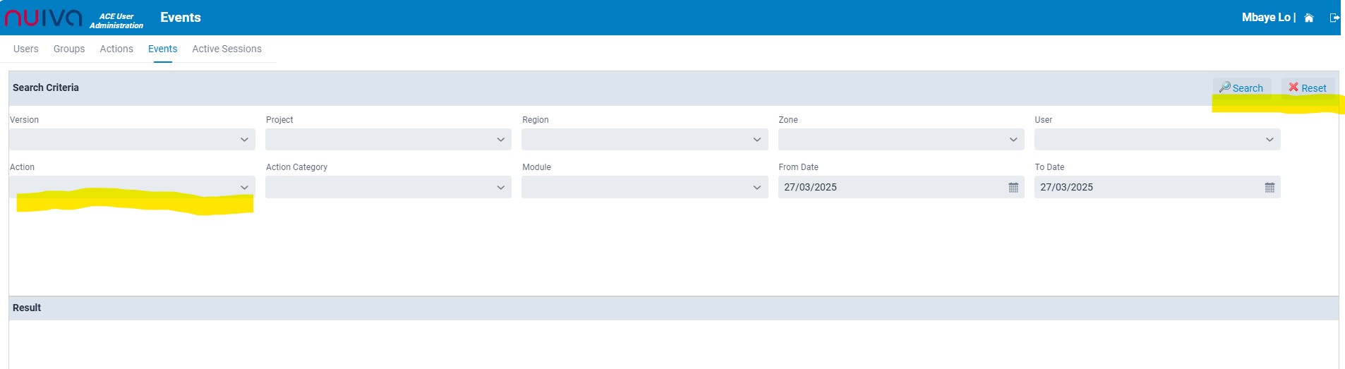
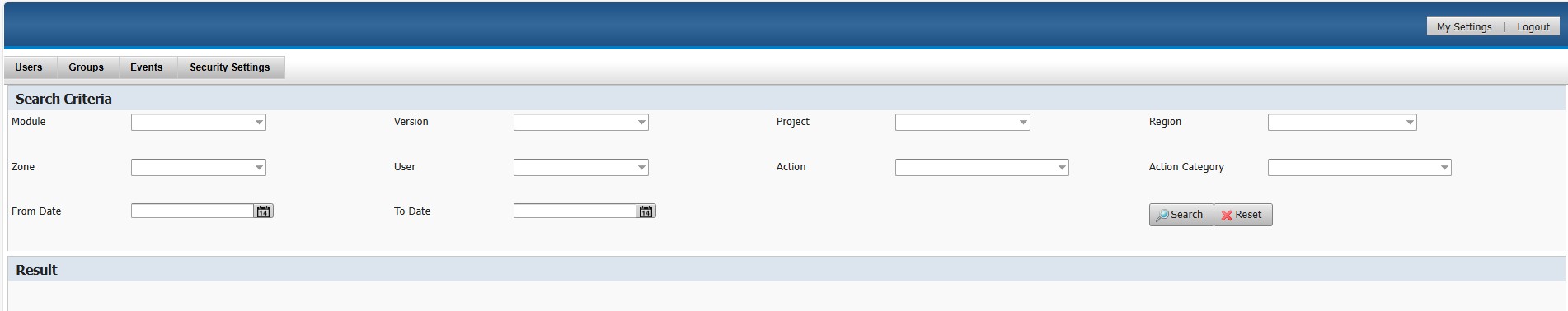
Improve the alignment, the contrast and uniformity of the fields. Make sure the dropdowns for "Version," "Project," "User," "Action," and others are consistently sized and aligned. The old version had a clean and aligned layout that should be replicated for a smoother user interface.
Attachments
Activity
- All
- Comments
- Work Log
- History
- Activity
- Links Hierarchy
- Transitions
- Trace
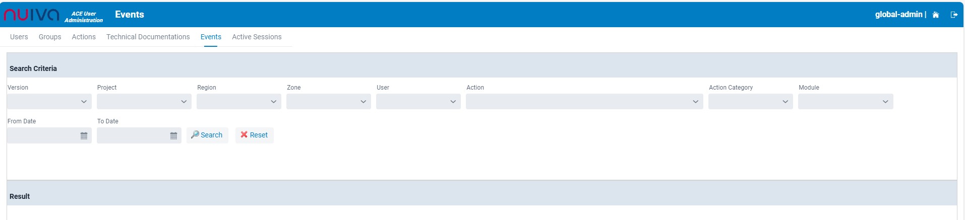
I've reduced the size of the ComboBox.
The label is generated by default above the field for all projects using Vaadin.
Show
 Abdel Rahman Tout
added a comment - I've reduced the size of the ComboBox.
The label is generated by default above the field for all projects using Vaadin.
Abdel Rahman Tout
added a comment - I've reduced the size of the ComboBox.
The label is generated by default above the field for all projects using Vaadin.
reduce the length of all filds and increase the contrast of all text filds names and Search/reset options
Use the Horizontal Layout to get a better View.
move the search and reset button to the top.
Show
Abdel Rahman Tout
added a comment - Use the Horizontal Layout to get a better View.
move the search and reset button to the top.
Fixed
However I find that the contrast of the text and for some bottons is not enough. It seems that the contrast of the non active buttons for example is generated by default in Vaadin.